
Did Facebook Kill the Infographic?
What Really Killed Infographics?
Is the Infographic dead? This confusing reality struck as I was updating a client’s social media calendar yesterday and saw on the future blog ideas, “Why We Love Infographics”. It became clear that it had a long time since infographics filled my Facebook feed. I couldn’t even remember the last infographic I’d seen. I also thought….did Facebook kill the infographic?
So What’s Going On?
The evolution and history of infographics is interesting in its own right, but the infographic as we know it was spawned from some graphic designer that wanted to enhance excel chart options. In the early 2000’s bandwidth exploded and allowed more graphic rich content to float around. Soon, political prognosticators like FiveThirtyEight gravitated toward unique graphic statistical representation and the rest of us were impressed.
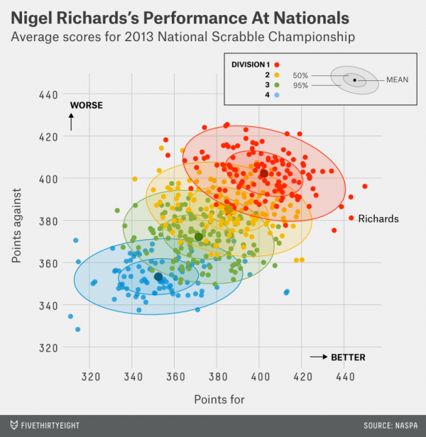
Interesting scatterplot from FiveThirtyEight
Did they become too popular? Did oversupply lead to avoidance? Did we become immune to click bait?
A few things happened:
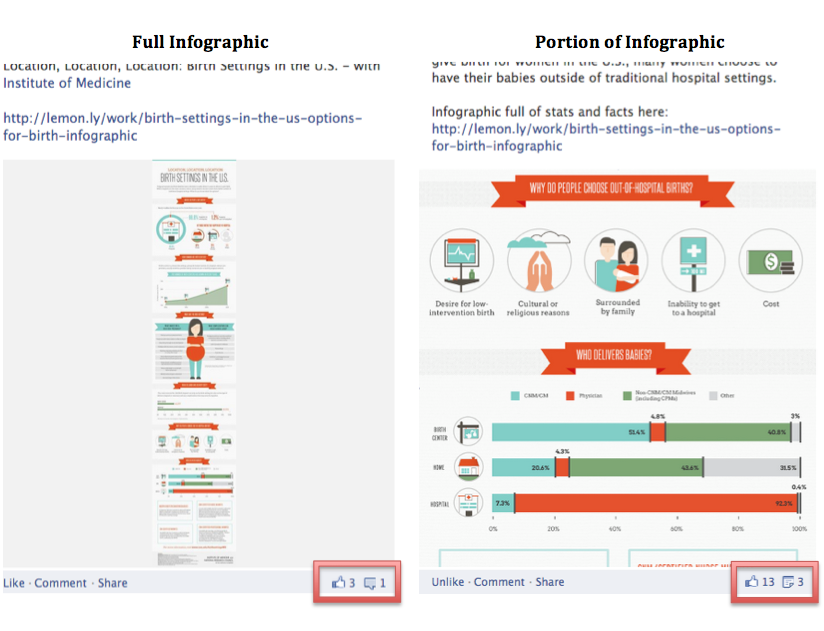
Facebook post before and after image standardization and cropping
Facebook killed infographics
2016 is the year Facebook figured out how to make money. With the release of Canvas and Insights, and the rounding out of paid post options, the sponsored content machine was completed. Historically sponsored advertisements looked much different than an ordinary post in your feed, but with the refinement in sponsored options, they now look very much the same as a typical post.
Facebook also implemented restrictions on posts that drew a line in the sand for sponsored vs. organic posts. Sponsored posts now have a limit of 20% text including wordmarks and text logos. There are plenty of concerns from advertisers about the 20% rule, but more than anything, it eliminated the possibility of boosting an infographic. It essentially forced anyone posting an infographic to create a lead-in image with a limited amount of text.
Additionally, image post sizes became standardized. Not long ago Facebook would automatically reduce the infographic image size to a thumbnail that could be easily enlarged. With standardization of image sizes Facebook now crops photos at centering points possibly resulting in a less favorable area shown.
There are a lot of ugly infographics
In a similar vein to websites, suddenly everyone with a computer became a graphic designer. A search for online infographic generators reveals an endless number of sites designed for making infographics. The result of everyone-graphics is poor design. This definitely contributed to the infographic abandonment.

Too Ugly to Read
Infographics are expensive to create
An effective and beautiful infographic take a lot of effort to create. Not just from a design side, but just as important is content. When we’ve undertaken an infographic, the success has always been correlated with the depth and interest of the content. Because of the ubiquity of infographics, designers want to have a fresh look with each creation and it takes a lot time to do that. Two things come into play when design time is in involve: 1) client investment and 2) client expectations.
Because the viral splash began to wear off from infographics throughout 2015, campaign results began to lag, but the cost for each design didn’t improve. We saw many advertisers choose other investment channels in an attempt to gain more exposure.
Infographics are fixed in time
Because of the development costs, many small businesses want to get extended exposure of out each infographic. Set aside the fact that infographics tended to be a viral propagation, each creation was stuck in time. I don’t know of any infographics we created that were later updated with new statistics.
Interactive content-widgets
Besides Facebook, the other major threat to infographics has been interactive content. Infographics were always about unique statistical presentation, but they always had some boundaries. They are fixed graphics. They are ribbon bound (expansive designs required longer page designs).
The slowdown in iPad app development meant a transition to new programming areas. Specifically, web development. Interactive widgets are everywhere now. They are unique. They aren’t page bound. They are adaptable. They are sharable. They are harder to steal.
Interactive web content
Here are a few examples:
Subaru
Answer The Public
Quartz – What You Call Your “Bros”
What will replace the infographic?
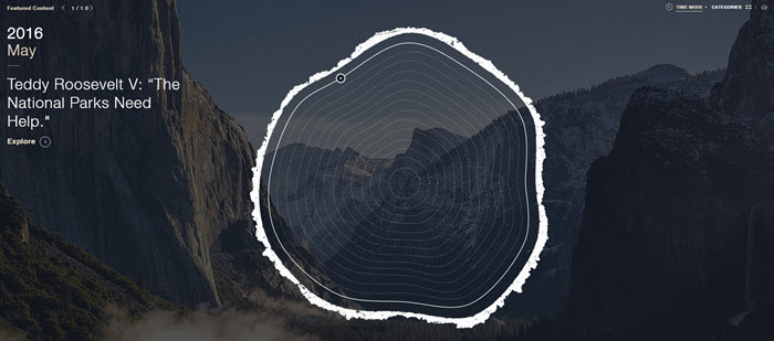
Web-based content will continue to expand in the near term, but the next phase of development will be specific to mobile and video. TED Talks have set the tone for presentation expectation that has been adopted by new designers. Expect video to become more interactive especially in articles like the recent release of Olympic athletes by the New York Times.

Interactive Athlete Profiles from the New York Times
ABOUT THE AUTHOR
Ben Lindberg, CR is a partner in Lion Tree Group, a digital marketing agency in Madison, WI. His expertise is in multi-platform brand messaging with a focus on inspiring homeowners. As an industry insider, he has walked the walk and developed a winning business campaign strategy from experience with one of Wisconsin’s largest remodeling companies. His agency specializes in digital design and branding updates. He regularly blogs at his company’s blog: The Bark and Roar.


