")
New Google Fonts You Need to Try in 2025 (+ Pairings)
Roboto, Poppins, Opens Sans, Lato, and Montserrat. These are the most popular Google fonts, and for good reason. They’re all highly legible and versatile fonts that work across many industries. But sometimes, we want to add some interest, step outside the box (or maybe just one foot out) and see what else Google fonts has to offer. Whether it’s just a fun accent or a bold headline to pair with a classic, or something new and unique, these are some of the fonts and possible pairings we are loving in 2025.
Why Google fonts?
From the timeless classics to new and trendy, Google Fonts is an ever-expanding resource not only for high-quality unique fonts from a variety of foundries, but also for web-safe, readable and accessible, fonts keeping it as a front-runner on our list when choosing fonts for web and print applications alike. Easy integration ensures performance and brand consistency across all browsers and platforms.
Why is your typography choice is important?
Typography is a core component of your branding, and sets the tone for what consumers should expect. Using the same type across your brand establishes consistency and builds brand recognition over time. Your font choices connect a brand to the proper demographic, and help communicate your message visually along with a logo, color, photos, etc. For example, a CPA is more likely to use a serif typeface to communicate trust and professionalism, or a tech company would use a sleek, modern, sans serif.
Our Favorites
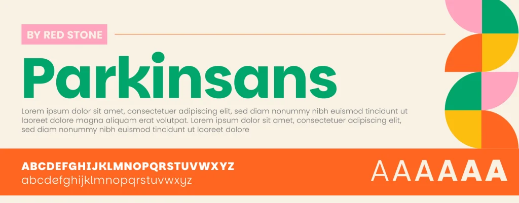
Parkinsans + Poppins

Shown in Bold, paired with Poppins Light + Bold
Originally designed for Parkinson’s UK, Parkinsans is a fun approachable headline typeface. Full of interesting shapes, for example in the K’s, lowercase A and E, and round O, Parkinsans’ geometry matches well with simple shapes and rounded corners.
Industries: Charitable Organizations, Healthcare, Technology, Insurance
6 WEIGHTS 300-800 | SANS SERIF
Download Parkisans
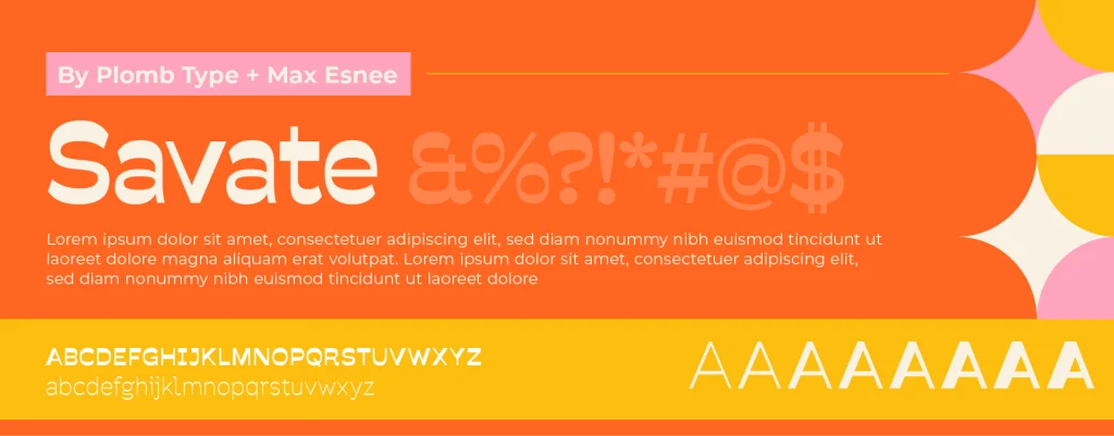
Savate
Shown in Semibold, paired with Montserrat Regular + Bold
Savate is an interesting reversed contrast typeface, with high impact and a somewhat retro feel, which lends itself perfectly to 2025 trends. Best used for shorter text or headlines, the dynamic typeface becomes a standout brand element in itself.
Industries: Athletic, Food + Beverage, Entertainment, Creative + Editorial
8 WEIGHTS 200-900 + ITALICS | SANS SERIF
Download Savate
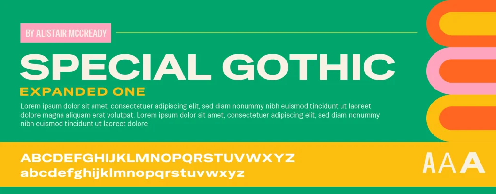
Special Gothic Expanded One
Shown paired with Special Gothic Regular + Special Gothic Condensed One
Special Gothic Expanded One is a big and bold typeface, with an industrial, almost brutalist feeling. Used at display sizes, this typeface demands attention, and is best supported with straight, simple elements. Special Gothic Expanded One is also available in regular and condensed versions, making Special Gothic very versatile overall.
Industries: Construction, Manufacturing, Athletic, Industrial
1 WEIGHT 400 | SANS SERIF
Download Special Gothic Expanded One
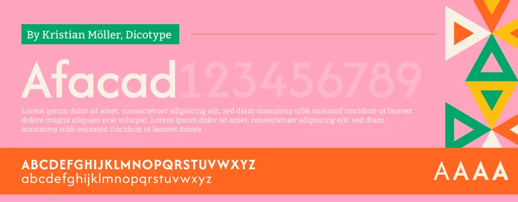
Afacad
Shown in Medium, paired with Bitter Regular
Originally started as a project to refresh address numbers, Afacad is a thoughtfully crafted, clean, and architectural typeface featuring – obviously – beautiful numerals. Afacad is a highly legible typeface, that works for headlines or body text, without distracting from other design elements.
Industries: Finance, Healthcare, Real Estate
4 WEIGHTS 400-700 + ITALICS | SANS SERIF
Download Afacad
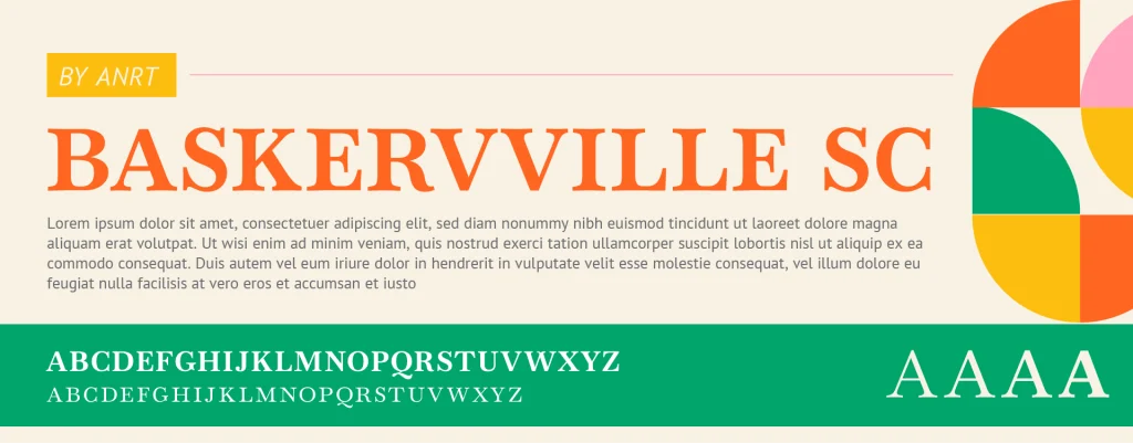
Baskervville Small Caps
Shown in Semibold, paired with PT Sans Regular + Italic
Baskerville is a timeless typeface, dating back to the late 1700s. Many revivals have been created since, including Claude Jacobs “Baskerwille alike fonts” with a w, in the 1800s, explaining the double v. Fast forward to today, Baskervville has been digitally perfected and modernized, while keeping all its heritage, sophistication and classic charm. Small-caps help Baskervville keep it’s personality and readability, allowing it to be used at smaller sizes, and not feel overpowering like all-caps.
Industries: Consulting + Law, Finance, Education, Food + Beverage
4 WEIGHTS 400-700 | SERIF
Download Baskervville SC
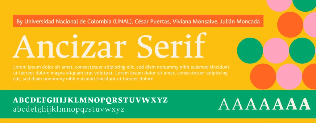
Ancizar
Shown in Medium, paired with Ancizar Sans Medium
Designed in 2014 to strengthen the institutional image of Universidad Nacional de Colombia, Ancizar was released in 2024 to the public. Shown above, the Ancizar type family is available in Serif and Sans Serif, plus small caps, making it a diverse family designed to adapt to any application, such as long form text, headlines, web, and large print. Ancizar Serif has a modern, contemporary, slightly artistic feeling as a headline, while Ancizar Sans has a similar feeling but much more clean. Swap the Serif to body and Sans Serif as a headline for an equally stylish yet completely different feel!
Industries: Hospitality + Lifestyle, Food & Beverage, Creative + Editorial
9 WEIGHTS 100-900 | SERIF + SANS SERIF
Download Ancizar Serif
Download Ancizar SansBirthstone
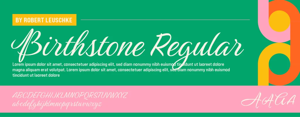
Shown paired with Bebas Neue Pro Expanded Bold + Extra Bold
Birthstone is a decorative script font, which feels somewhat handwritten yet refined, making the font more personal, expressive, and readable in comparison to other scripts, and cleaner than other handwritten fonts. Swashes and alternates make Birthstone highly customizable, and can change the feeling from casual to more formal. While used as a headline above, Birthstone is generally best used in moderation, for example as an accent, or single word, at larger sizes.
Industries: Wellness + Beauty, Residential, Hospitality + Lifestyle, Artisan
1 WEIGHT 400 | SCRIPT
Download Birthstone
Great design starts with great typography. Whether you’re refreshing your own brand, designing for a client, or just exploring what’s new, these fonts offer style and function. Use Google Fonts to bring personality into your 2025 designs, and allow your type choices to do some of the talking. Happy designing!


