
The Trend for Mobile Design and the Impending Verticalocalypse
Consumer mobile behavior is changing design – are you ready to take the leap?
Mobile adoption is channeling a new UI with portrait-first website design and app development.
The mobile traffic conversations we’ve had recently as a team at Lion Tree Group could just as well be from a team of yes-men cheering at a Samsung or Apple board meeting. We’ve moved past the early adoption period for mobile devices and have quickly transitioned directly into prosthetic mode. Mobile devices have become of fixture in our daily and nightly lives. We touch our phones more than 2,500 times a day, and we use them as a crutch for our brains. Mobile devices are deeply embedded in our daily routine, and because of our dependency issues, we’re seeing transitions in new site design to accommodate the way we hold devices.
A few years ago, we piloted a mobile-first concept with a few clients. We knew the mobile wave was coming and Google had forced the hand of website designers by announcing the addition of “mobile-friendly” to their almighty algorithm. So the table was set for mobile to surpass desktop users. We readied the wagons by developing with mobile layouts and then reverse engineering responsiveness to desktop. Now we’re taking another step and designing specifically for mobile – and having the ability to limit views to only mobile devices.
So how is this changing the website design game?
- Vertical video hayday
- Narrow or stacked site layouts
- Portrait-oriented maps
- Full screen overlay ads
- Turn-free images and video
- Picture-in-picture continuous play
One of the biggest changes our team has had to adjust to is vertical video. This strutted through office about a year ago with the bravado of a peacock.
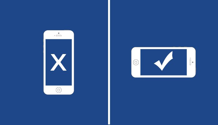
Vertical video bad, landscape video good.
We also enjoyed this PSA called Vertical Video Syndrome.
A few of us laughed at all the clueless vertical videographers, but a few others complained that landscape videos didn’t work correctly on their device or, even worse, they were tired of continually teetering between portrait and landscape in their hands. “It’s a one-hand vs two-hand thing,” an unnamed office mate quipped. I didn’t get into the specifics of that statement, but it did start to make us think differently about design.
Uncharted Territory for Mobile Web Design
From the first days of design, our minds have tended to favor horizontal layouts. Our world is generally flat and horizontal and we’re biologically designed to see more left/right than up/down. But once again, our laziness is winning out over logic and biology to produce a new vertical future. Here’s a prediction for next year:
In 2018, vertical video views will overtake landscape views on mobile devices. In fact, we’re nearly there now.
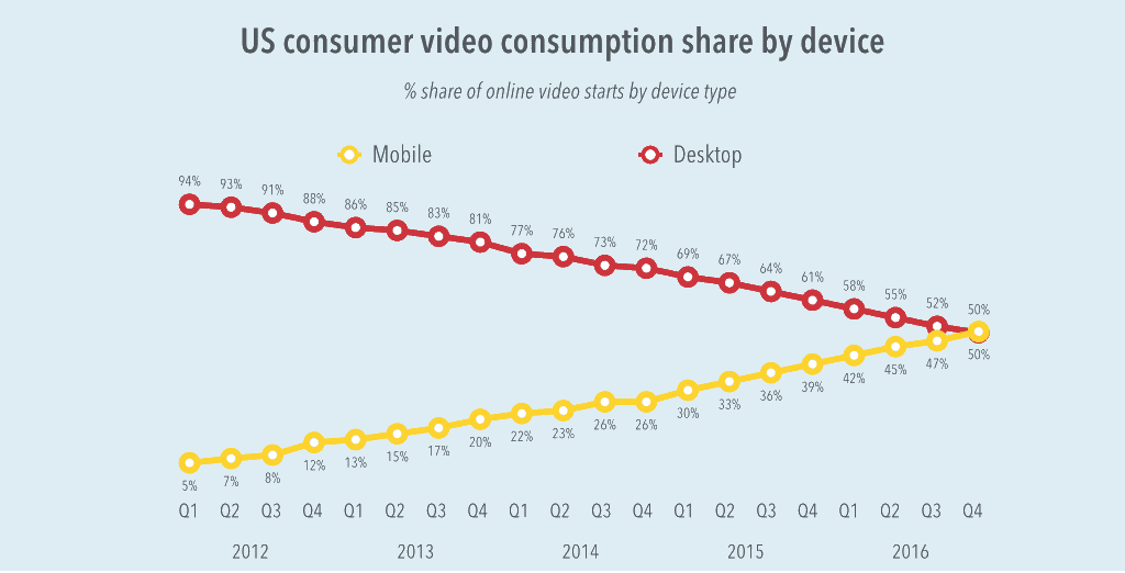
Video View Trends – no pattern here, right?
As phones become more integrated in our lives – controlling the lighting and climate of our homes, feeding our pets, observing our kids – we also have to accept convenience. It’s leading us straight past mobilegeddon and into a mobile-only atmosphere.
The rise of Facebook Live and Snapchat (both created in vertical layouts) has simply upped the likelihood of the conversion happening sooner than later. Specifically, the momentum Snapchat has generated convinced me to start taking vertical seriously in our advertising plans. If it’s changing for us, it’s coming soon across all industries, and very soon. Will you be ready?
As a point of reference, I am the luddite in our office and still harbor the tendency for an occasional keyboard slide attempt on my iPhone. Of course, getting denied serves as a good reminder that verticalocalypse is coming.
About the Author
Ben Lindberg, CR is a partner in Lion Tree Group, a marketing agency in Madison, WI. His expertise is in multi-platform brand messaging with a focus on inspiring homeowners. As an industry insider, he has walked the walk and developed a winning strategy from experience with one of Wisconsin’s largest remodeling companies. His agency specializes in digital website design and branding face lifts. He regularly blogs on his company’s blog: The Bark and Roar.


