How to Make Revolution Slider Look Better on Mobile Devices
You have watched many videos and have finally figured out how to make a great revolution slider. You think you have it set-up perfectly but yet, it doesn’t look so great on mobile devices. Here is how to fix that.
The odds are, you have not truly optimized it for mobile devices, you used the automated device settings. And here is how to set up your revolution slider correctly. You can also see a lot of different resolution slider implementations in our portfolio.
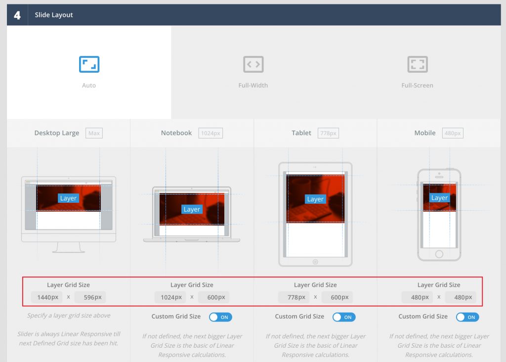
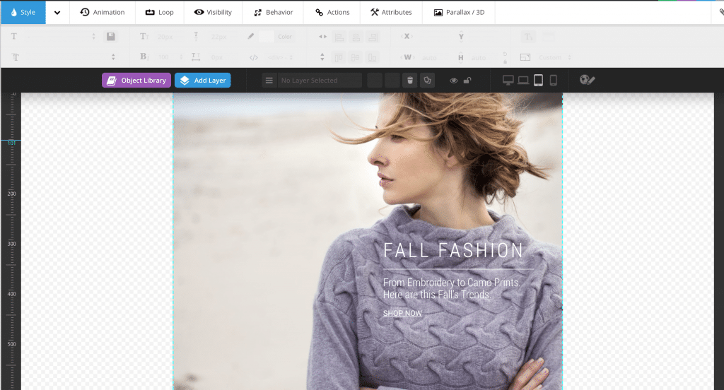
STEP 1 – GO TO REVOLUTION SLIDER SETTINGS
In section 4, you will see Slide Layout. This is where you can adjust the size based on how much screen you would like the slider to cover on each of the devices. If you leave the custom grid size off, the content will be adjusted automatically, which often results in small text on mobile. Adjust the size as you wish.
Full screen size for most phones is 1080 x 1920px.
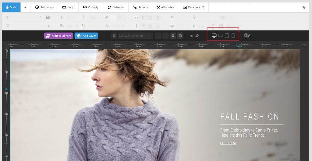
STEP 2 – GO TO YOUR FIRST SLIDE
Now that you have customized your slide layer grid sizes in Slider Settings, you will be able to preview how your slider looks on each one of the devices. You will see the device options right under the main styling section. Preview each one of the devices and make sure it looks great.
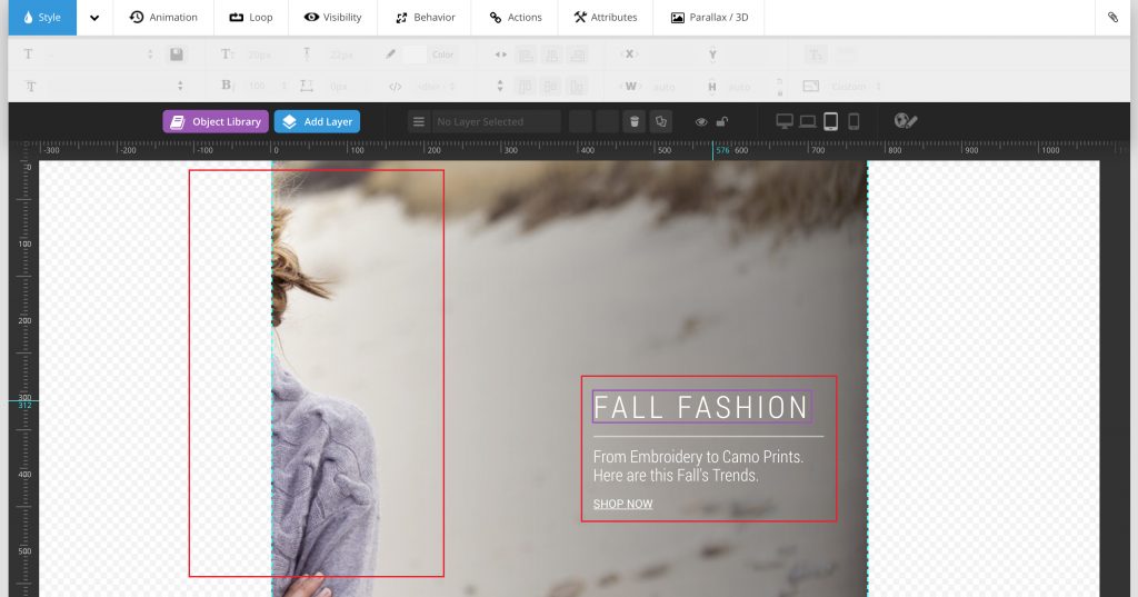
STEP 3 – MAKE ADJUSTMENTS
Let’s say your text is not lining up correctly on the ipad or the size is too big. Stay on the device preview and adjust as necessary (change font size and text placement). CHANGES PER EACH DEVICE WILL NOT AFFECT ANY OTHER DEVICE LAYOUTS OR MAIN SLIDER SETTINGS. Make it perfect on each one of the devices. If you used a background photo that also does not look good, move to the next section to see how to fix it.
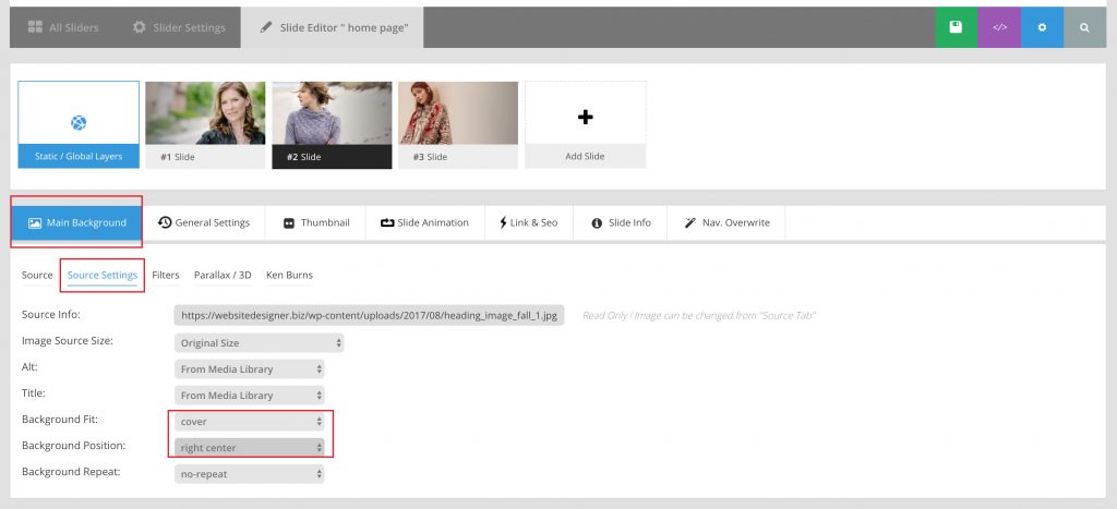
STEP 4 – ALIGNING THE BACKGROUND PHOTO ON DEVICES
If you used a background photo and it’s cut-off on a vertical device you can resolve it by adjusting its general alignment. In the Main Background you will go to the Source Settings (second text tab). Here is where you will align your background photo to best fit your image. If the focus of your image is on the left side of the screen, you will align Left Center. It all depends on the photo you are using. Make sure you pick the right one for your slider.
Visit our website design portfolio to view different options for revolution slider. We show interesting animations and unique designs, including video integrations. We hope this helps – have fun designing!


